The third phase of Six Sigma DMAIC is the Analyze Phase. This is where the statistical study of a problem starts. The Define phase states the problem, the Measure phase collates data and uses it to measure performance. In this phase statistical reviews are done to the groups of deviation or variation in order for project owners to identify which are the considerable contributors to the output. The focal point of this phase is to identify and analyze the root cause/s of imperfection.
This phase consists of several steps which also require several tools. The phase usually starts by organizing the experimentation schedule to identify which of the potential KPIV’s (key performance indicator variables) is the real origin of defects. Sufficient amount of data is also required. This set of data will be analyzed using an appropriate statistical procedure.
Target of this phase is to determine the KPIV’s that are making the major effect on “Y” also known as output. Any misuse found should be identified and prioritized to improve.
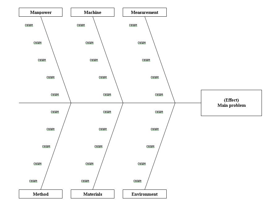
The most common tool used in this phase is the fishbone diagram also called the Ishikawa graph. This is a graphical demonstration of possible problem causes. The chart will show the association of cause and effect. The advantage of using this tool is that it stimulates the reasoning during brainstorming activity of possible causes. It gives visual presentation of possible causes. The possible causes are grouped, therefore reducing the chances of omitting some possible causes. And since the causes are charted, project owners will see and understand the relationship between possible causes.
Constructing a fishbone diagram is not that easy. Since this is done during a brainstorming activity, conflict of ideas and opinions are always expected. The good thing is that the outcome is always reliable and sound. The activity starts by reviewing the focused problem. Since the diagram is a fishbone, the main problem should be written on the head part of the fish. Major categories will take the part of the major bones. The most common major categories are the 5M and E. This stands for Manpower, Machines, Materials, Measurement, Methods, and Environment. After plotting the six major bones, determine specific problem causes that falls on each major category.
 These problem causes which is plotted on each major category should be labeled as either N, C, or X. N is marked for uncontrolled variables or those which is not constant. C is given if variables are constant, also requires customary operating measures to guarantee consistency. X on the other hand refers to the variables that need to be researched on to identify what control each has on the Y and what their best possible settings should be to reach desired performance.
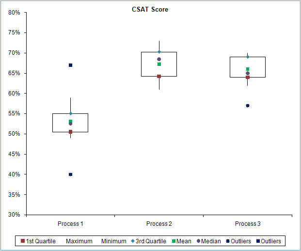
Another tool used in analyze phase is the box plot or the whiskers plot. This is fitting to use if the data sets are as few as ten – twelve values. However, this is not suitable if sample size is less than ten. This gives a graphical review of a data set showing the measure of middle location, two measures of spreading, the skewness, and the outliers. Outliers are known as the values that don’t seem to be part of the standard data. The box displays three values: the median (Q2), the lower quartile (Q1), and the upper quartile (Q3). Extending from the box are lines also known as the whiskers which lengthens to the maximum and minimum value.
To create a box plot, several values must be computed. These are:
- Quartile One (Q1) – is the average of the lowest twenty-five percent of the data set
- Quartile Three (Q3) – is the average of the highest twenty-five percent of the data set
- Maximum (Max) – is the biggest value amongst all data set
- Mean – is the standard value
- Median – is the center value of a data set
- Minimum (Min) – is the least value amongst all data set
- Inter Quartile Range (IQR) – using the formula Q3-Q1, this is the middle fifty or the midspread
- Outlier Low – using the formula Quartile One – 1.5 * Inter Quartile Range or higher than
- Outlier High – using the formula Quartile Three + 1.5 * Inter Quartile Range

Box plot gives an interpretation that if the median is centered in the box and the whiskers are of equal length, it is known to have symmetric data set. This is evident if the mean and the median is close to each other. The range of the whiskers and the inter-quartile box indicate the stretch of the data. Common rule is that, the smaller the box and the shorter the whiskers, the better. This means that values are close to each other. Defect can easily be detected.
Scatter plot or scatter diagram is another tool used to analyze a given set of data. This evaluates the influence of one value to another. This graph includes two different sets of variables represented on two different axes, the horizontal axis and the vertical axis. This diagram gives two types of information. Visually, we look for outlines that the two sets of data related to each other.
If the two sets of data are related to each other, we then identify in what way they are related. The relationship amongst two variables is known as the correlation.
We identify correlation just by looking at the plotted dots. If the dots on the diagram go right, correlation is positive. This means that the two variables of different sets are related to each other. If the dots on the diagram go left, correlation is negative. Opposite to positive, the relationships amongst two variables are weak. And if the dots are scattered, no tendency of going right nor left, the data sets has less correlation or no relationship at all.
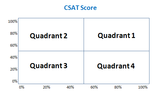
Correlation is identified with the use of quadrants. Scatter plot has four quadrants. The most ideal is Quadrant One. Based on the sample diagram below, this is where both values of both data sets pass. Quadrants Two and Four shows that values on first data set failed while the other value on a second data set passed, and vice versa. Quadrant Three is where both values of both data sets failed.

This is the most important phase amongst all five phases of DMAIC. The action items that will be created in the succeeding phases will be based on the result of thorough analysis. It is a must that project owners uses the right tool to come up with a holistic and accurate result.
