The Pareto principle also known as the 80-20 rule derived from the Italian economist Vilfredo Pareto’s observations about the factor of sparsity which states that 80% of the effects are coming from 20% of the causes. This also holds true to the business’ rule of thumb that 80% of the sales are contributed by only 20% of the customers.
As a tool in Six Sigma, Pareto is part of the quality control tools that are derived from historical data in order to come up with efficient and most appropriate actions to address most common and impacting failures. With the use of Pareto, scarce resources are efficiently allocated. The principle dictates that 80% of the failures are coming from 20% of the causes. It is important to note that this tool wholly bases recommended actions on present data. It does not consider probable increase or decrease and projected movements of any one contributing factor.
To further illustrate, the Pareto chart has been designed as a visual representation of the vital few against the trivial many. With the help of the chart, it is easy to identify the causes of most of the problems. Below is an example of a Pareto chart:
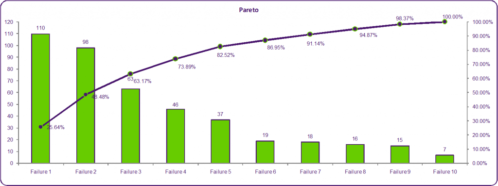
Pareto Chart Example
Let’s take the food service setting as an example to illustrate the Pareto principle. We will base our study on data gathered from customers’ comments on the survey sheets provided to them. We will use the information below:
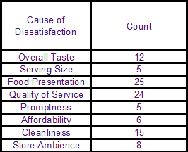
Pareto Exercise Chart Food Serving Survey
The survey yielded 100 counts of dissatisfied customers and their reason for the dissatisfaction. The first step in using the Pareto Tool is to rank the failures according to their Count (eg. The frequency of occurrence) from highest to lowest:
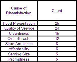
Pareto Exercise Chart Food Serving Survey Step 1 Rank Failures
The second step is to compute the percent distribution of each failure. We do this by dividing the count of each failure by the total number of failures, then multiplying by a factor of 100. For example our biggest failure in this imaginary survey is “Food Presentation” where a total of 25 failures were accumulated. We’ll divide this by the total number of failures, which is 100, then we multiply this by 100 to get the actual percentage – so in the end the corresponding contribution of “Food Presentation” to the overall failures is 25%:
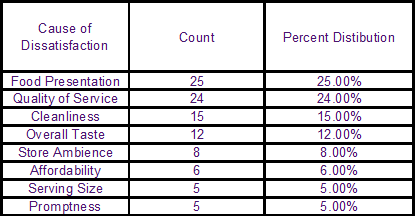
Pareto Exercise Chart Food Serving Survey Step 2 Calculate Percentile
In the third step, we’ll compute the cumulative contributions of the failures in order of their rank. To do this just add the contribution of the preceding failure to the next (in percentage) like this:
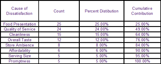
Pareto Exercise Chart Food Serving Survey Step 3 Calculate Cumulative Contributions
Now you are ready to construct your Pareto Chart. You will need the failures, count and cumulative contribution. Highlight these variables, then using Excel format go to the “Insert” tab and click on Column chart. It should look like this:
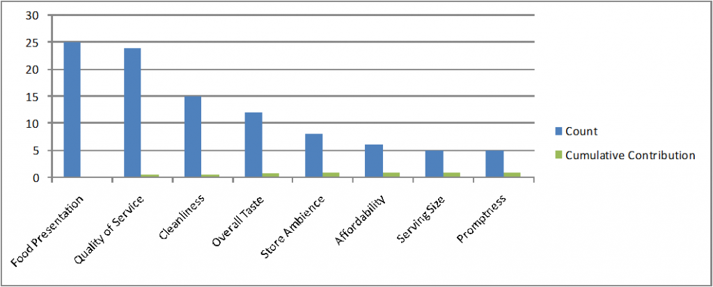
Pareto Exercise Chart Food Serving Survey Excel Example
Click and then right-click on “Cumulative Contribution”, under “Format Data Series” choose secondary axis. Your table should appear as below:
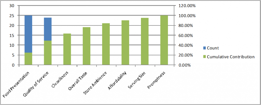
Pareto Exercise Chart Food Serving Survey Excel Example Sorted By Cumulative Contributions
Click on the “Cumulative Contribution” again to change chart type from bar to line chart to complete the Pareto chart:
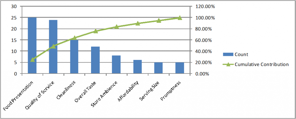
Pareto Exercise Chart Food Serving Survey Example Sorted By Cumulative Contributions Line Chart
Pareto Analysis
Using the data above, we noticed that the 80% contribution lies somewhere in between “Food Presentation” and “Overall Taste” or “Store Ambience” with the first 2-3 factors having the biggest weight. This is the Pareto principle of unequal distribution of causes and effects – 80% of the problems are caused by 50% of the factors.
Of course in reality it doesn’t have to be a perfect 80% / 20% distribution, and don’t get caught in the 80/20 stigma of thinking that it must always equal 100%. In reality you may see number such as 50% of market share being controlled by 1% of the market players, or 90% of the problems being contributed by 30% of the factors.
To learn more about the Pareto Principle you might want to check out “The 80/20 Principle: The Secret to Achieving More with Less” by Richard Koch
The conclusion from this example is that the store can focus its scarce resources in addressing the top four reasons for dissatisfaction which are:
- “Food Presentation” – 25%
- “Quality of Service” – 24%
- “Cleanliness” – 15%, and
- “Overall Taste” – 12%
and effectively resolves 80% of the problem of dissatisfied customers.
Without the Pareto, the business entity might be spreading out their resources in trying to address all of the reasons of dissatisfaction. Or they might be concentrating on minor issues like “Serving Size” (5%) and “Promptness” (5%) which don’t really have a strong impact compared with “Food Presentation.”
From the customers’ point of view, based on the data, they don’t mind waiting a bit, getting smaller portions and paying more. But, they want their food nicely presented – which might call for better plates and platters, waiters and service crew to be nicer and a spic and span surroundings.
Multi-Level Pareto
To better determine the reasons behind the failures, a multi-level Pareto can be used. Let’s take “Quality of Service” and construct a second level Pareto. From the 24 respondents that expressed dissatisfaction from the quality of service, we pinpointed the following reasons:

Multi Level Pareto Table Example
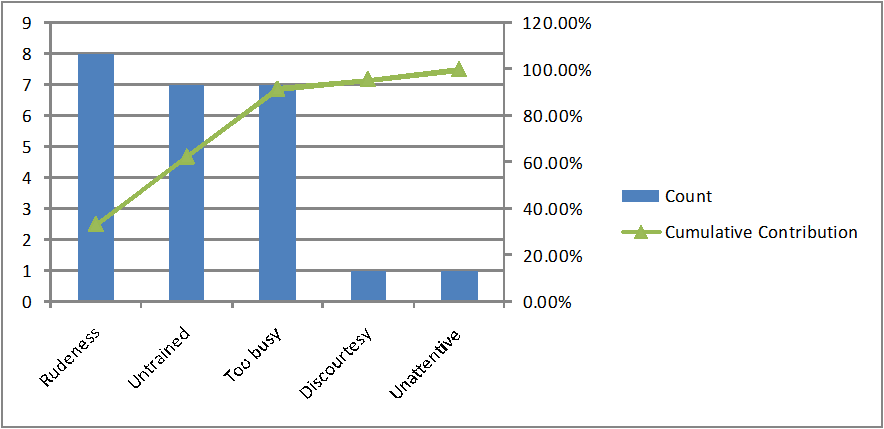
Second Level Pareto Chart Example
The second level Pareto chart will give the breakdown of the reasons that resulted in the failure. You can still deep-dive to further levels as needed.
Weighted Variables
It’s not uncommon for entities to apply weights to the established failures. This is to give emphasis on failures that the company considers being more impacting to the business’ performance. By giving weights, the frequency of the failure is not the only basis for computing its contribution the problem. Let us again use the same example above, this time we’ll apply the weights:
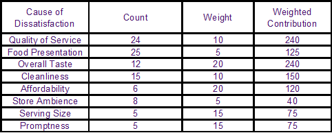
Pareto Chart With Weights
We have assigned weights assuming on the factors that the business is focusing on. Based on the weights we applied, we are assuming that the business thinks “Affordability” and “Overall Taste” are the major selling points of the company. They also consider “Food Presentation”, “Cleanliness”, “Quality of Service” and “Store Ambience” the least important factors to their goals.
We will rank the failures according to their weighted contribution:
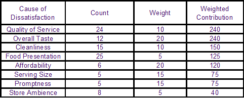
Pareto Chart With Weights Ranked
Percent Distribution and Cumulative Contribution will now be based on the “Weighted Contribution” and not on the count. Below is your completed table:

Pareto Table Percent Distribution Cumulative Contribution Weighted Contribution
Using the weighted contributions, there will be a resulting shift in the rankings. This time, “Quality of Service” and “Overall Taste” tied as the top-ranking failures. In constructing the Pareto chart, you will now use the weighted contribution of the failure instead of its count. Again, this is because we are now taking into consideration the company’s views of the problem as well as that of the customers. Your Pareto chart should look like this:
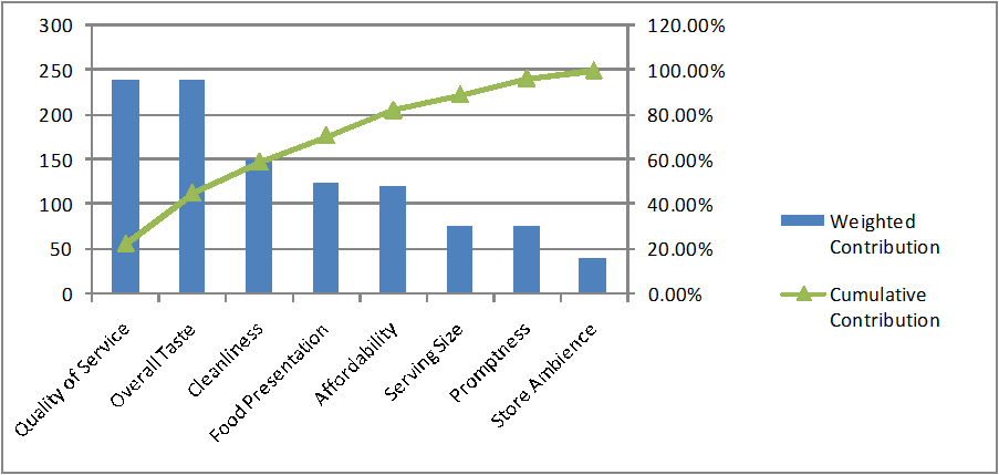
Pareto Chart Percent Distribution Cumulative Contribution Weighted Contribution
Again, 80% of the problem is coming from just five failures, “Quality of Service”, “Overall Taste”, “Cleanliness”, “Food Presentation”, and “Affordability”. Its top two issues already contribute more than forty percent of the problem of dissatisfaction among customers. These two could effectively represent the “vital few” and the rest of the failures correspond the “trivial many”.
In this case, the company thinks that is could alleviate its customer satisfaction while meeting its goals at the same time if it can improve its quality of service, come up with better cooking, clean-up the place, improve on the food presentation and lower down the prices.
Re-directing company’s time, effort and money in resolving the top reasons for the failures of a given problem will result to an efficient resolution. Managers will have an overall idea of what’s causing the problem the most, separating them from the low-impacting issues.
Pareto analysis only applies to historical data and will not provide forecast analysis. Another limitation of the Pareto is that it relies only on the data which it is based on.
