Individual Moving Range or as it’s commonly referenced term I-MR, is a type of Control Chart that is commonly used for Continuous Data (Refer Types of Data). This was developed initially by Walter Shewart and hence the Control Charts are sometimes also referred to as Shewart Chart.
As the term indicates, in I-MR we have two charts – one with Individual data points (Individual Chart or I Chart) and the other chart has data points that are range values derived between consecutive individual points (Moving Range Chart or MR Chart). The two charts are useful together and using only one may not give the complete information on the behavior of the process.
The I-MR Chart data cannot be sub-grouped as in the case of -R Chart as individual data points and data points of ranges are important for creating and interpreting the process information correctly. It should be noted that the data points should be in timely order i.e., data points captured in the time order should be maintained in the same order and not re-ordered for our convenience.
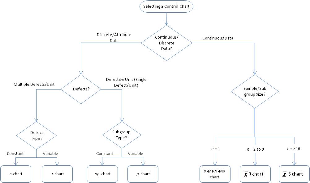
Selecting the Right Control Chart
With such a powerful tool as Control Chart in our hands, one would definitely be interested to know where and how to use it for predicting the process performance. The below flow chart would help in determining the Control Charts to be used based on different data types, samples/subgroups and defects/defectives.
How Does I-MR Chart Work?
As mentioned earlier, there are two charts for I-MR, Individual Chart and Moving Range Chart – let’s discuss it one-by-one and see how it compliments each other to interpret the process information.
The formula for calculating the Lower Control Limits (LCL) and Upper Control Limits (UCL) are:
| Control Limits for I Chart = |
Control Limits for MR Chart

Where,
![]()
With the calculations in hand, it will be lot easier for us to start our work. As already discussed, we have two charts in I-MR –
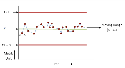
Individual Chart plotting the individual data points over a period of time. This is useful in detecting the trends and shift that are present in the process. This will help us visualize the common cause and the special cause variations, if any. It should be noted that the data generated should be sequential i.e., in the same order in which it was captured against time axis, as the trends and shifts are studied and best interpreted against time performance.
Moving Range Chart is as the name indicates, is a chart which is created by plotting the values derived from the time-ordered sequential data. Each Moving Range point is calculated as Xn – Xn-1 and hence we will have one data point lesser than that in the Individual Chart.
The MR Chart helps us in assessing the stability of the process caused by the variation between consecutive individual data points. Whenever the points are out of Control Limits, it indicates that the process is unstable. This will help us in identifying the Special/Assignable Cause that triggered the process to become unstable. After exploring the reason for the cause of outlier, the same should be fixed and removed from both I and MR Chart. Whenever we find the variation to be huge in MR chart, we should refer to the I-Chart and determine the cause of the variation as the I-Chart will have the exact individual data points against the time period which had caused the high variation.
So, to conclude, one must know that the IMR chart can be plotted for individual data points where n=1. The data points should always be continuous and captured in time sequential order over a period of time. With this information in mind, it will be easier to work with the IMR data.


